Scroll Down

Qey

Sustainability Index

Scroll Down

About

QEY : Pronounced [Key]

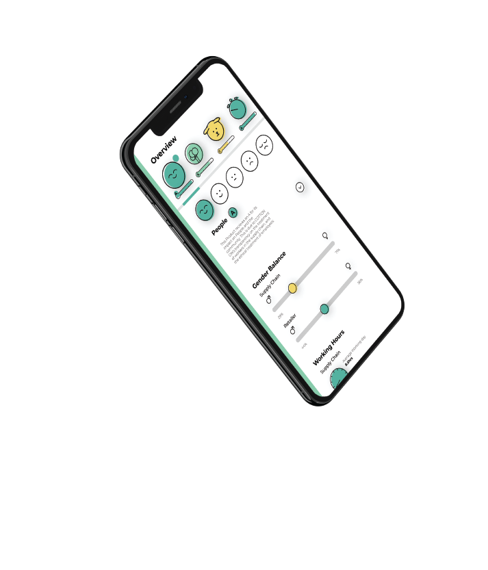
Qey is a sustainability index that provides a transparent system to identify the impacts of consumer goods upon the world. Through data visualisation, Qey is designed to inform and educate consumers about the impacts of our purchasing habits on not only the environment, but the wider community.

Qey works to compile complex information and present it in an intuitive and simple format that is easily understood and accessible. Qey scores a product through the summation of four contributing factors; the ethical impacts upon humanity, the environmental impacts, the impacts upon animals and the longevity of a product.

How it works


By employing a Simple A through to F system, Qey provides an overall grade that is calculated by the analysis of the aforementioned characteristics. This grade is then published on the tag of a product alongside the country of origin information. Though a dynamic branding system the logo can also be presented as a QR code, that can be scanned to provide justification for the reasoning behind the grading.

Product Categories


The A-F grade is relative to the product category as opposed to an explicit score. This is to aid in the consumer decision process. The practice of manufacturing a smartphone is much more environmentally taxing than a t-shirt, however, both are necessary. Thus, it would not be helpful to the consumer if every smartphone ranked poorly, however if graded within the product category, consumers are able to make a choice comparing similar products and gain an understanding of their purchasing habits.

Branding

Qey is an exploration of data visualisation, signs, symbols, colours and semiotics, and how they can depict and convey information.  Qey is a banding system that represents an index of sustainability, it is a visual wayfinding experience that navigates the sustainability of consumer goods. It is a fluid branding system that is underpinned by information design, with the intent of being dynamic. The central ‘Globe’ brandmark is a line illustration that changes, retrospective of the geographical location in which the product that bears the logo is manufactured. Therefore, a product made in China, the logo will depict the Chinese continent, for a product of the USA, the Americas will feature in the globe.

Brandmark

Sustainability is a global issue. It is dynamic and constantly evolving as humanity becomes more aware of the consequences of our actions.  Our Planet is vast and rich. It is home. We only have one. As a symbol it represents everything we know. This brandmark may be small, but it is here for something a little bigger.

Brandmark

The Moon


The Moon orbits the Globe logo and houses the overall grade (letter) that a product has earnt. The location of the Orbit is also indicative of the grade it possesses. Moving in a Clockwise direction starting at 0 Degrees. The Grade of a product is then reinforced with colour.

Brandmark and Colour


Colour is intrinsic to the Brand identity and the subsequent Grading System. To fit with the theme of being environmentally conscious. Colour is only present with screen-based representations of the brand system. All print media is absent of colour to minimise the use of materials such as ink. The colour in the brandmark directly corresponds with the grade awarded to a product.

Brandmark

Colour


The colour system is based on the principles of colour association. Designed to resonate with a wide audience, the colour pallet has been designed to appeal to consumers fundamental understanding of different colours and their meanings. Inspired by the traffic light system, Qey employs red, yellow and green as the colour foundation. The warmer colours are engineered to draw from the fundamental psychology of consumers, evoking notions of caution. The cooler tones, reserved for the higher graded products signifies growth, stability and nature.

Inclusive Design

The colours have also been developed to assist those with vision impairments. The cooler tones have been revised to include blue hues, increasing contrast for those with Protanopia and Deuteranopia colour blindness and thus making the ends of the spectrum easier to distinguish.

Iconography

Typography

Typography

User Interface


The user interface begins in the physical world. Working with branding and printed tags to engage consumers. Once a consumer has interacted with the branding system they can engage in the digital interface. The UI has been designed to integrate with all mobile operating systems. The mobile website has been designed to be as intuitive and engaging as possible. Putting important information in the hands of the consumer in as few steps as possible.

Brandmark

Now you have
seen the light

Now you have

Welcome to
the Dark

Hint - Press the orange Circle

Montserrat

Dark mode

Brandmark